Introduction to Vastu Shastra and Main Entrance Colors
Vastu Shastra is an ancient Indian approach to architecture and design. It is focused on aligning human dwellings to the underlying ways of being that govern nature. From Vastu, which means dwelling in Sanskrit, it provides methods to balance directional alignments, elemental energies, and spatial geometry ensuring that we live harmoniously and in abundance.
Of all the aspects of a dwelling, the main entrance of a home is most important. The main entrance is the main entry way for prana, or energy, to enter the house. The orientation and architecture of the entrance with appropriate color collectively impact the energy coming into your home. In Vastu, colors are more than decor; colors carry vibrations and are attracted to the elements unique to Vastu and its directions. Proper Main entrance Vastu colors can bring in prosperity, clarity, positiveness, and balance in your life while improper colors can create mental trouble, financial trouble, or relationship trouble.
Significance of the Main Entrance in Vastu
In Vastu Shastra, the entrance is known as the “Simhadwar” or “mouth of energy”. Just like cosmic energy enters the house through the main entrance, food comes into the body through the mouth to nourish the body. So it is the “face” of the house as it provides the symbolic and energetic markup for the entryway. A Vastu for Home Entrance : Top Tips for Main Door Vastu does the following:
- Allows energy to flow freely.
- Attracts wealth, growth and happiness.
- Filters negativity from entering.
- Represents the five elements, Earth, Water, Fire, Air and Space.
The color is a key element to achieve this. Each direction represents an element, and Vastu Shastra entrance color tips give prescribed color tones to increase the energy of that element.
Best Colors for North Facing Entrances
The North direction relates to the deity of wealth, Kubera, and is ruled by the Water element. The North direction is also connected with your career, opportunities, and financial gain. Best colors for home entrance as per Vastu for North direction:
- White: It signifies purity, clarity, and freshness, which allows maximum light to come in. It also brings prosperity.
- Off white or cream: An unrefined version of white but can act is a sympathetic balance to the Water element.
- Silver or metallic grey: It brings a sheen of wealth, is ruled by Mercury, which represents this direction.
- Light blue or sky blue: It promotes calmness, creativity, and expansion, and improves intuitiveness and business clarity.
Ideal Colors for East Facing Entrances
East is the direction of new beginnings, health and vitality. It is associated with the Sun (Surya) and the element of Air. If you are looking to improve your health and vitality and cultivate feelings of optimism, choose colors representative of the morning sunrise. Best Entry Colors for Home (East) Vastu:
- Yellow: Is bright and intelligent. It activates health and visibility while energizing the environment.
- Orange or peach: Sociability and warmth.
- White or off white but with yellow undertones: These colors balance the solar energy of the East direction, with cleanliness and simplicity.
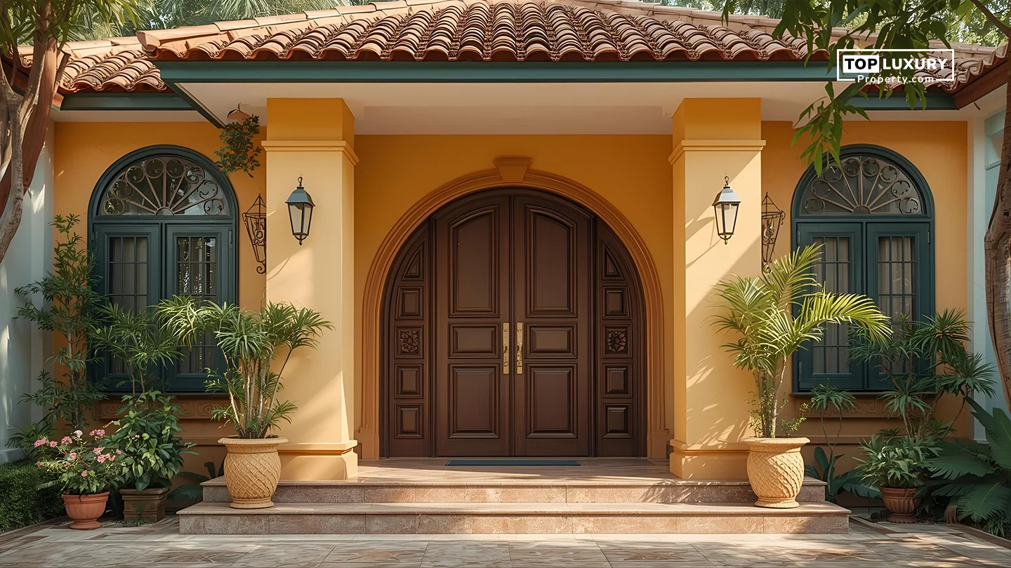
Recommended Colors for South Facing Entrances
The South of Vastu is ruled by Yama, the God of discipline and justice. It is governed by the Fire element, and is associated with strength, reputation, and control. Since fire is a strong, and sometimes aggressive energy, care needs to be taken in colour usage to ensure it is stabilizing. Vastu colors for main entrance (South):
- Terracotta or burnt orange: strong, rooted, symbolizes endurance.
- Brick red or maroon: symbolizes boldness and strength.
- Chocolate brown or deep tan: provides stability and grounding.
Styles Suggestion: A warm maroon door with bronze handles and rustic earthy stone steps looks regal and authoritative, especially with cream or beige walls. This denotes authority and protection.
Suitable Colors for West Facing Entrances
The West direction is aligned with Varuna, the water god and cosmic order who is associated with the Earth and Water elements. It has an effect on relationships, support systems, and creativity. Good Vastu Colors for West Entrances:
- Light grey: Represents neutrality and stability.
- Powder blue or soft teal: Improves creativity and emotional flow.
- Off white or light beige: Provides calm, especially in hotter climates.
Colors to Avoid for the Main Entrance
While it’s true that certain colors enhance directional strengths, some encore energy or create an imbalance within the space. It is best to simply avoid these colors no matter the current trends or your personal preference.Inauspicious Colors for your Entrance:
- Black: Absorbs energy and may introduce stagnation or negativity.
- Very dark brown or grey: Feels heavy and constricting, especially for east or North doors.
- Neon colors (neon green, pink, electric blue): Affects energy by overstimulating and perhaps creating restlessness or lack of focus.
- Bright purple or deep violet: Miraculously, there’s never a base for most any elemental energy in pure form.
- Overly bold reds for north/east: lash with water or air elements, creating friction.
Enhancing Positive Energy with Vastu Compliant Colors
Color is not everything, it needs to be accompanied by cleanliness, lighting, and Vastu tenets in decor. Colors should be used wisely or in conjunction with, Energy Boosting Activities:
- Decorative torans (mango leaves, marigold flowers) for purifying energy.
- Om or swastika in gold or red paint.
- Natural light or soft yellow light to increase positivity.
- Floor rangoli or entrance mukhya kolam white rice flour is purifying.
- Display seasonal flowers or plants at the entrance that follows the color theme of the doorway.
Combining Colors for Aesthetic and Vastu Benefits
In modern design, homeowners often wish to blend Vastu recommendations with aesthetic needs. This is completely achievable through smart color pairing and accents. Tips for Blending Vastu and Style:
- Choose complementary shades like warm yellow with ivory or sky blue with silver.
- Use trims, grills, or door handles to bring in metallic elements that match the direction (e.g., brass for south, stainless steel for north).
- For two tone designs, use Vastu color on the main panel and a neutral tone on the frame.
- Match colors with natural elements stone, wood, metal, or glass—depending on the directional energy.
- Paint accessories such as nameplates, number plates, or doorbells in harmonious shades.
By combining tradition with personal taste, you can enjoy a balanced home that is both energetically aligned and visually stunning.
Practical Tips for Applying Vastu Colors to Your Entrance
- Determine Compass Directions: A magnetic compass or smartphone app will give you the exact direction of your entrance.
- Test Paint Sample Swatches: You should test out several different shades in the light first.
- Keep Finishes Consistent: Satin or matte finishes are more favorable in Vastu than glossy ones, as glossy finishes tend to be too reflective and harsh.
- Make Sure to Align Colors with Exterior: The door should stand out from the rest of the house without clashing with the exterior of the rest of the house.
- Fix Cracked or Peeling Paint: A door that is damaged or fading in color, even if it is the correct color, diminishes energy.
- Put Down Clean Doormats: Earth toned or color matching doormats ensure dirt does not come inside and ground the energy.
Conclusion
Choosing your main entrance Vastu colours is a dedicated step that brings more than just decorative consideration; it is a pathway to naturally usher in prosperity, peace, and positivity into your life. By understanding the elemental nature of each of your directions, and the associated Vastu entrance colours, you are able to tune your entrance colour to align yourself with your environment. North facing doors can benefit from the purity, freshness and light of whites, blues, and silver. East facing doors can accentuate the positive impacts of bright colours in yellow, peach, and soft orange. South facing doors enhance the qualities associated with deeper earthy and warm colours in terracotta, brown, and deep reds.
West facing doors, stay lively in greys, snow blue, and off whites. It is best to avoid overly dark and even black, obnoxious neon, misplaced colours or shades of dark that will fail to properly energize your day to day living, including overhanging signage, etc. Use the other elements.


_(2)_638647637563832478_820465_.webp)